Webflow Card Slider: Enable on Mobile, Disable on Desktop (No Code Required)
Learn to optimize Webflow's Card Slider effortlessly. Enable on mobile, disable on desktop with a seamless, code-free approach.
You can find the template here.
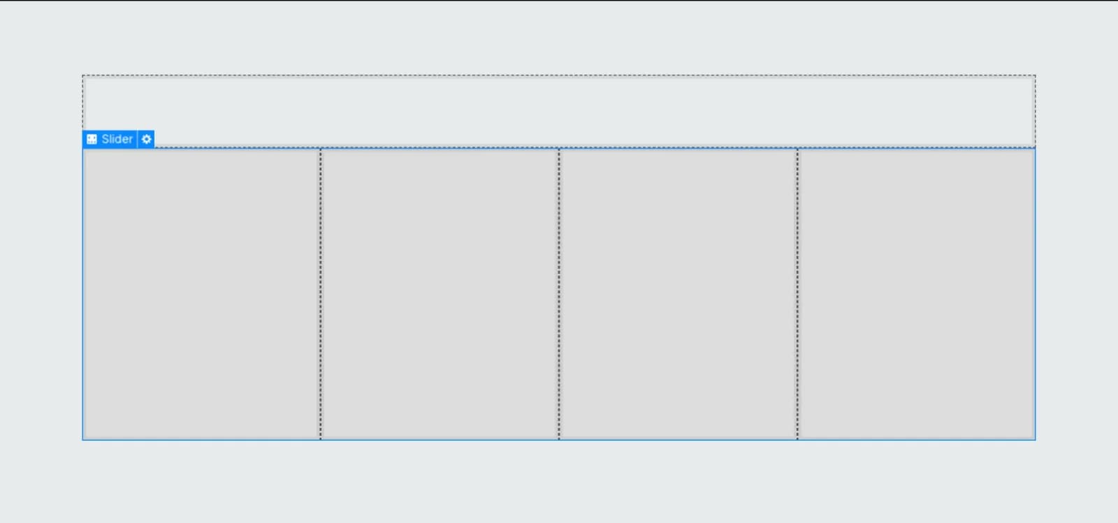
Integrate the Webflow native slider component into your preferred location on the webpage.
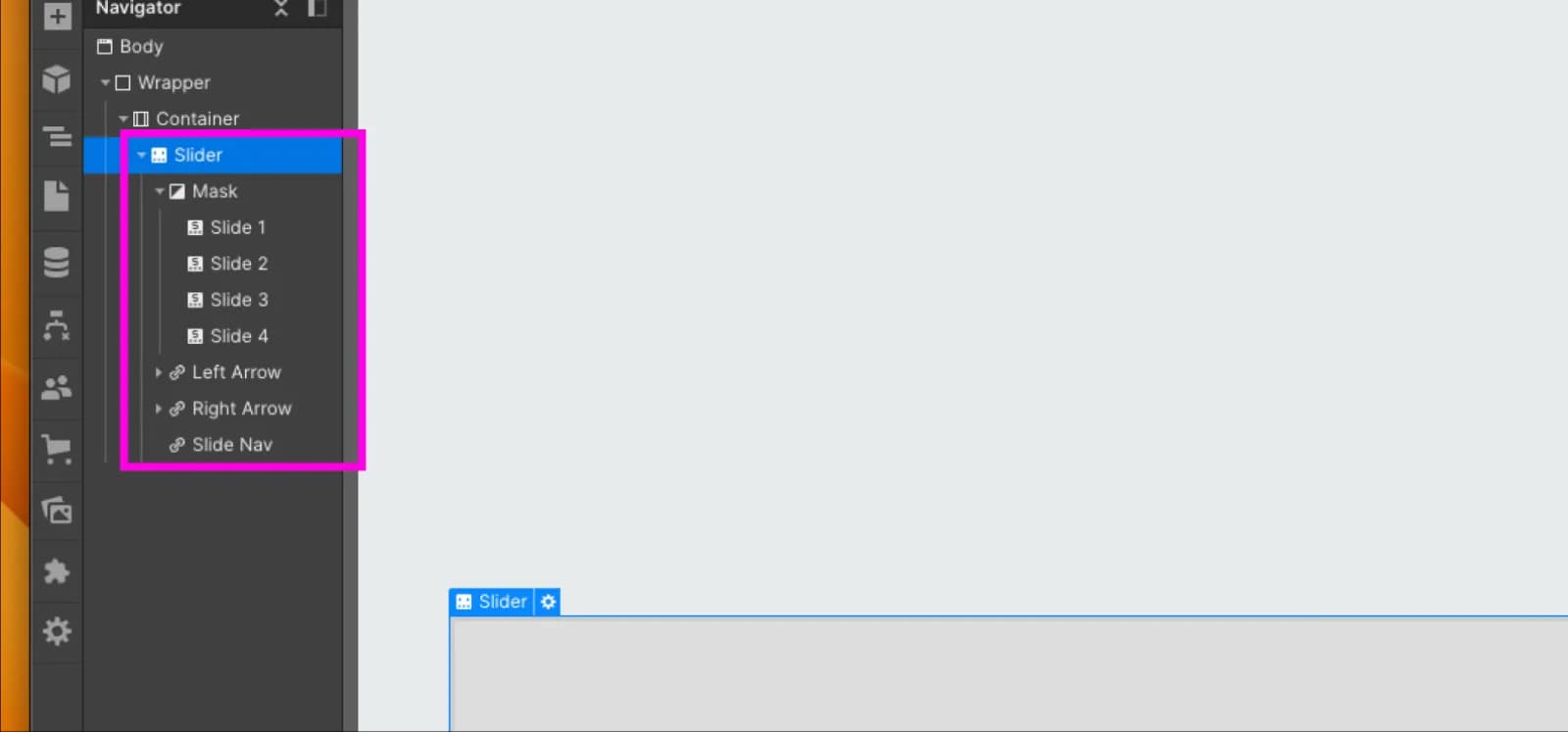
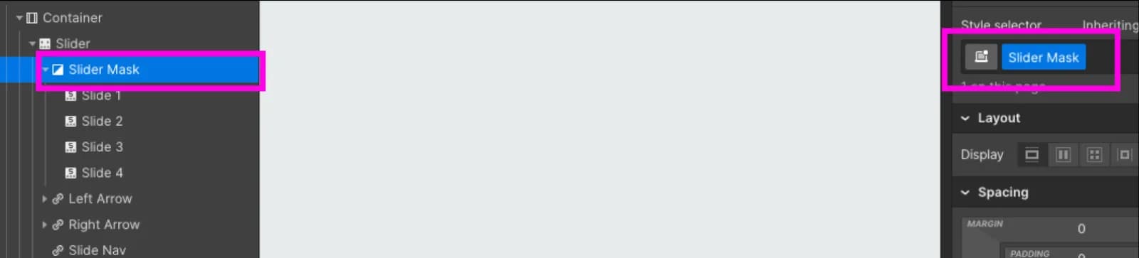
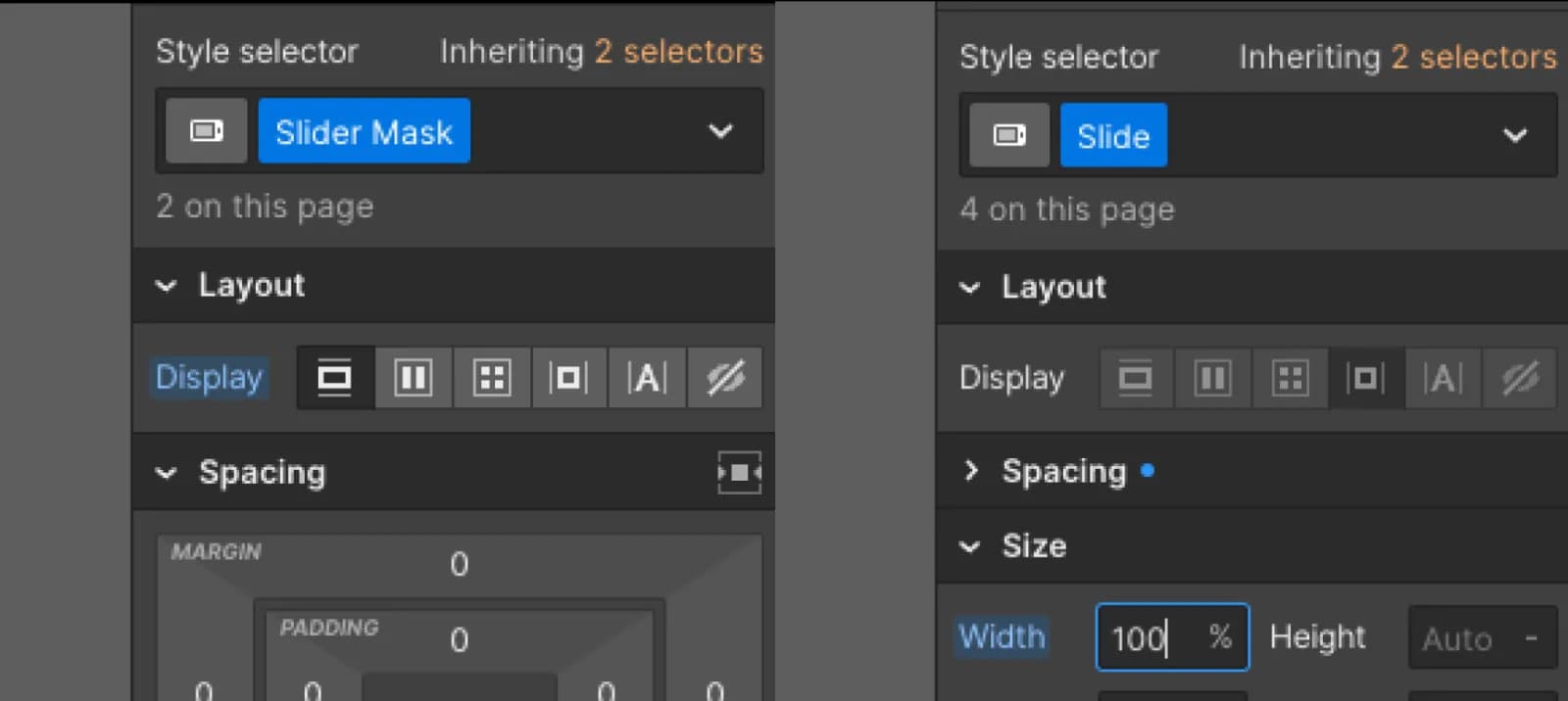
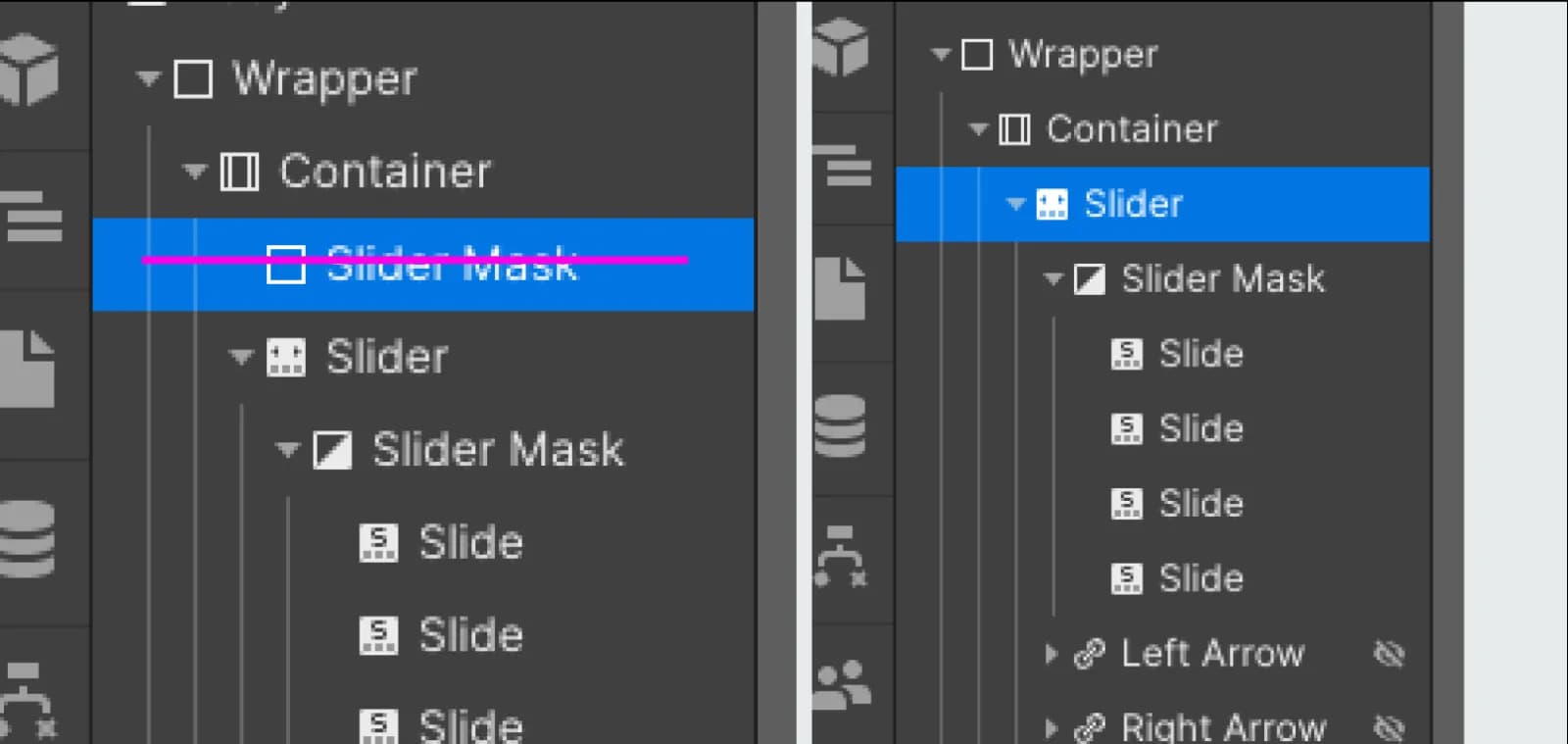
Webflow's slider mask layout is unalterable by default. To achieve our objective, introduce a div outside the slider, mirroring the CSS styles of the slider mask.
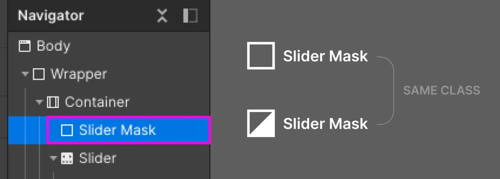
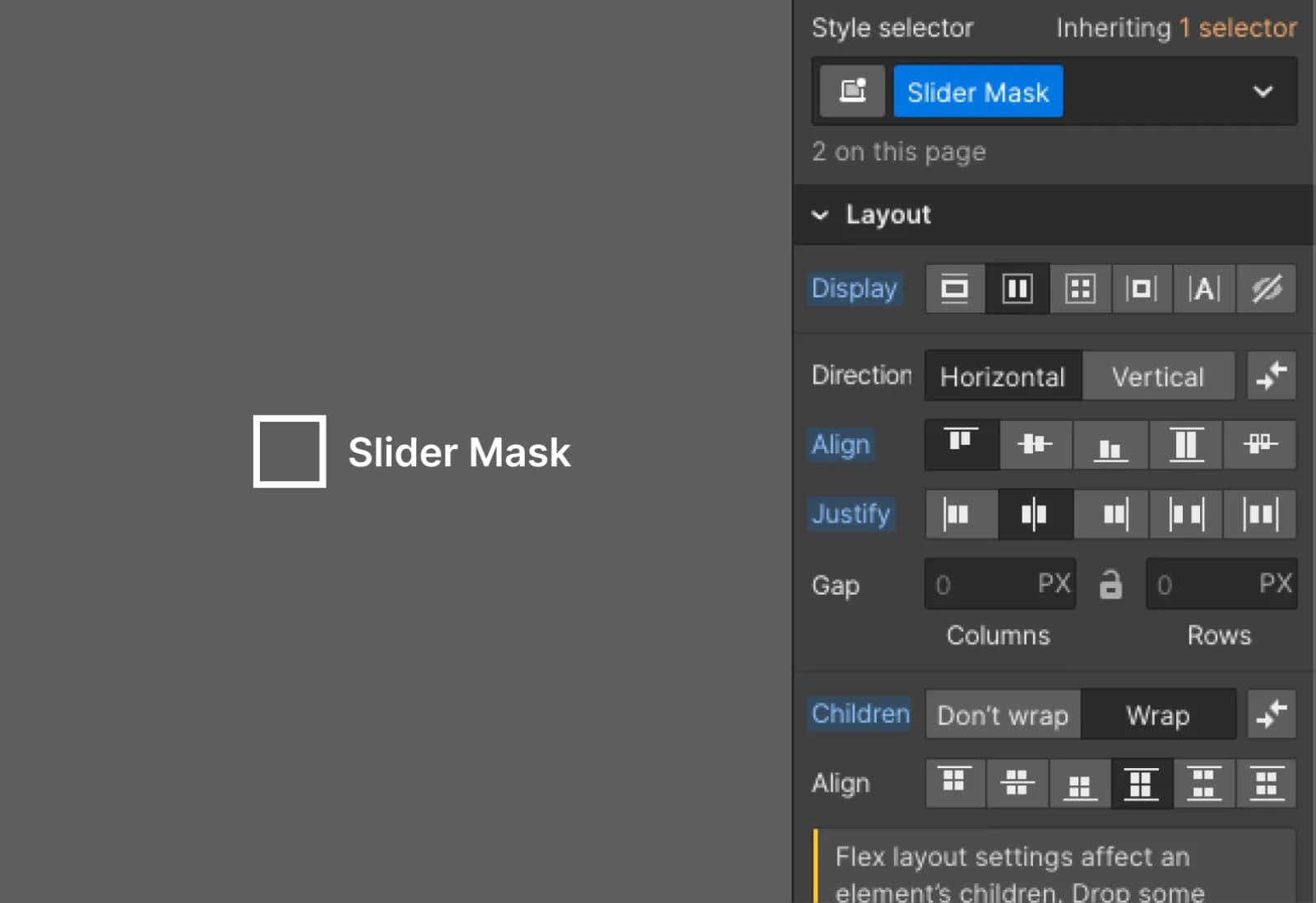
Modify the div's layout to impact the slider mask's layout.
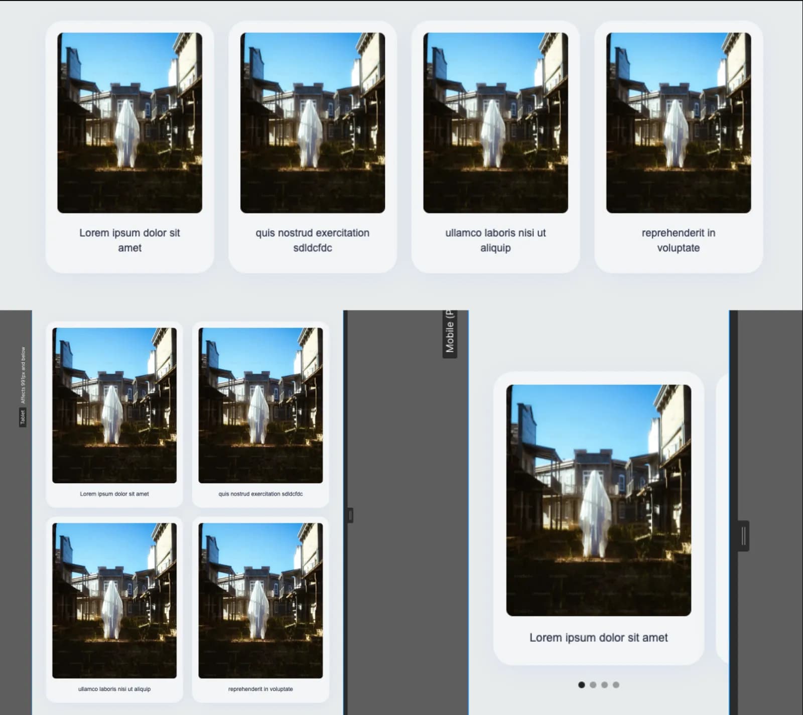
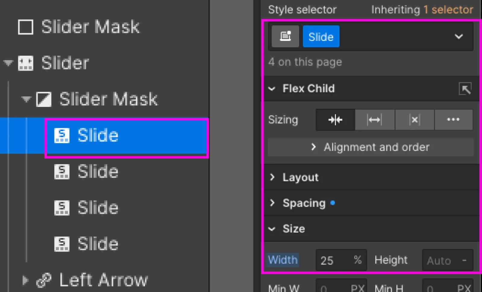
By this stage, the desktop slider mask layout is already adjusted. Customize the CSS styles for the slides within the slider, setting the card width to 25% (assuming four slides, divide 100% by 4; adjust as needed).
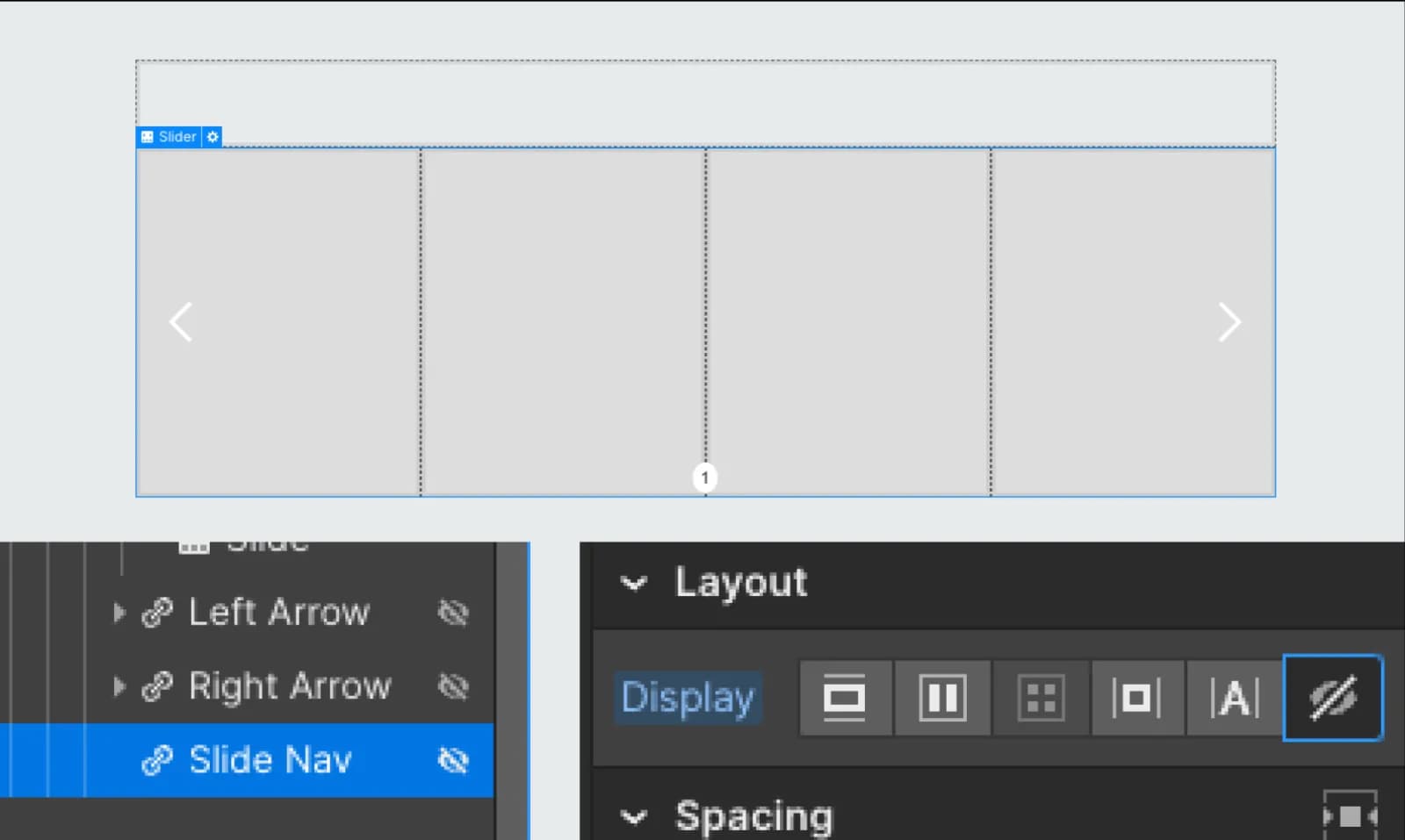
Post-adjustment, this is the slider's appearance. Desktop doesn't require slider arrows or navigation, so hide them with "display: none."
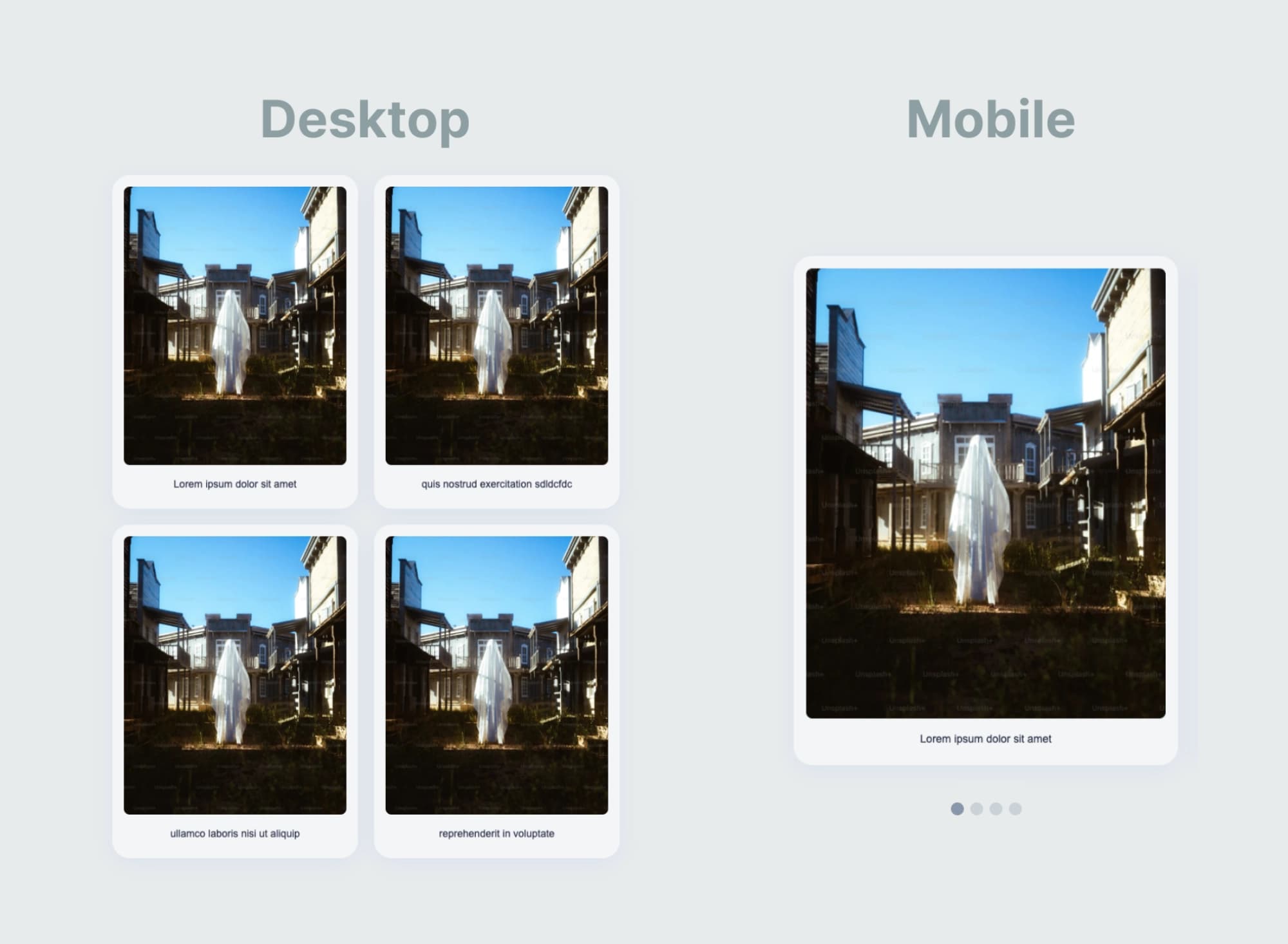
The updated look is displayed in the image below.
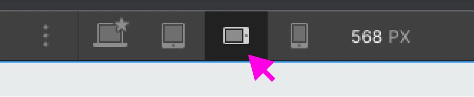
Now, let's optimize the slider for mobile to restore Webflow slider functionality.
Use a div with matching styles to reset the slider mask layout to static. Adjust slide width to 100%.
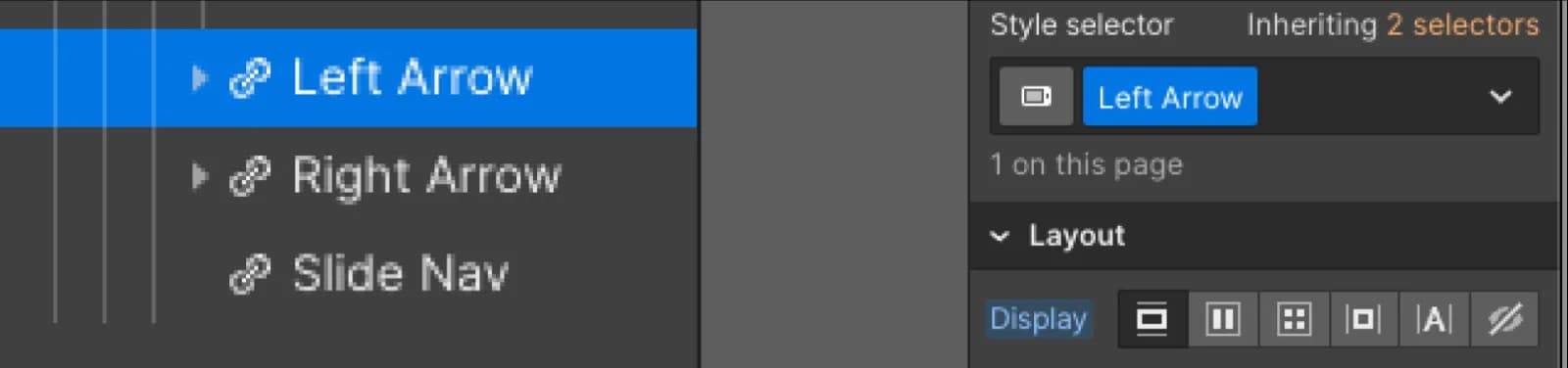
Enable left and right arrows and slide navigation as necessary.
Eliminate the div on the page with matching styles to the slider mask.
Feel free to exercise creativity and fine-tune CSS styles as required within these foundational steps, and you're all set!